Rodrigo
Lopes
Graphic and Editorial Designer, 7+ years in. I gravitate toward editorial and typography-driven work. Books, magazines, anything with pages to turn.
Currently at capsi creative studio.
Experience
Graphic Designer internship
Graphic Designer ongoing
Education
Master's Degree in Advanced Typography
Bachelor's Degree in Graphic and Multimedia Design
Certifications
Fundamentals of Digital Marketing
Certificate of Advanced English
Languages
Portuguese
English
Spanish
French
Software
- Adobe Creative Cloud
- Affinity Suite
- Glyphs/FontLab
- Figma
- Microsoft Office
- Google Workspace
Soft Skills
- Client communication
- Project & budget management
- Autonomous, self-directed work
- Attention to detail
- Cross-team coordination
10/20
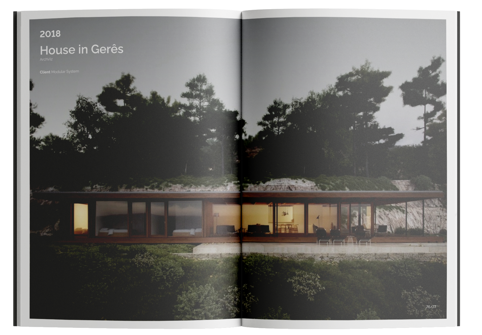
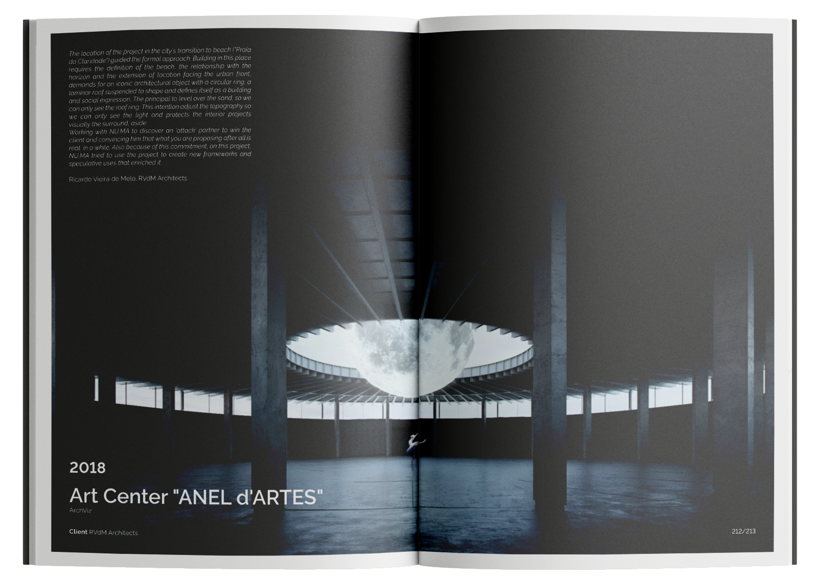
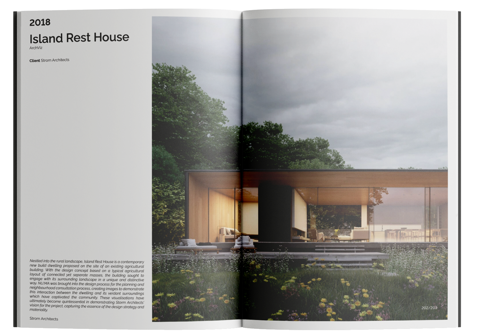
A book marking ten years of nu.ma, 2010 to 2020, spanning both their built architecture and visualisation work for others. The brief was to let the images talk: a white frame around every picture instead of a bleed, sized so a reader's hands never cover the work, with text kept to the rare moment it earns its place.
A book marking ten years of nu.ma, 2010 to 2020, spanning their two practices: architecture of their own, and visualisation for others.
The brief was to let the images do the talking. So the design stays out of the way: a white frame around every image instead of a full bleed, sized so a reader's fingers land on the margin, never on the picture itself. A small fixed index in the corner, year, project title, discipline, client, is the only other constant. Text appears only when it earns its place, a short architect's quote, a line of context, never more.
Built work and rendered work are never separated into sections. Same sequence, same treatment, same weight, the way the studio itself never distinguished between the two.
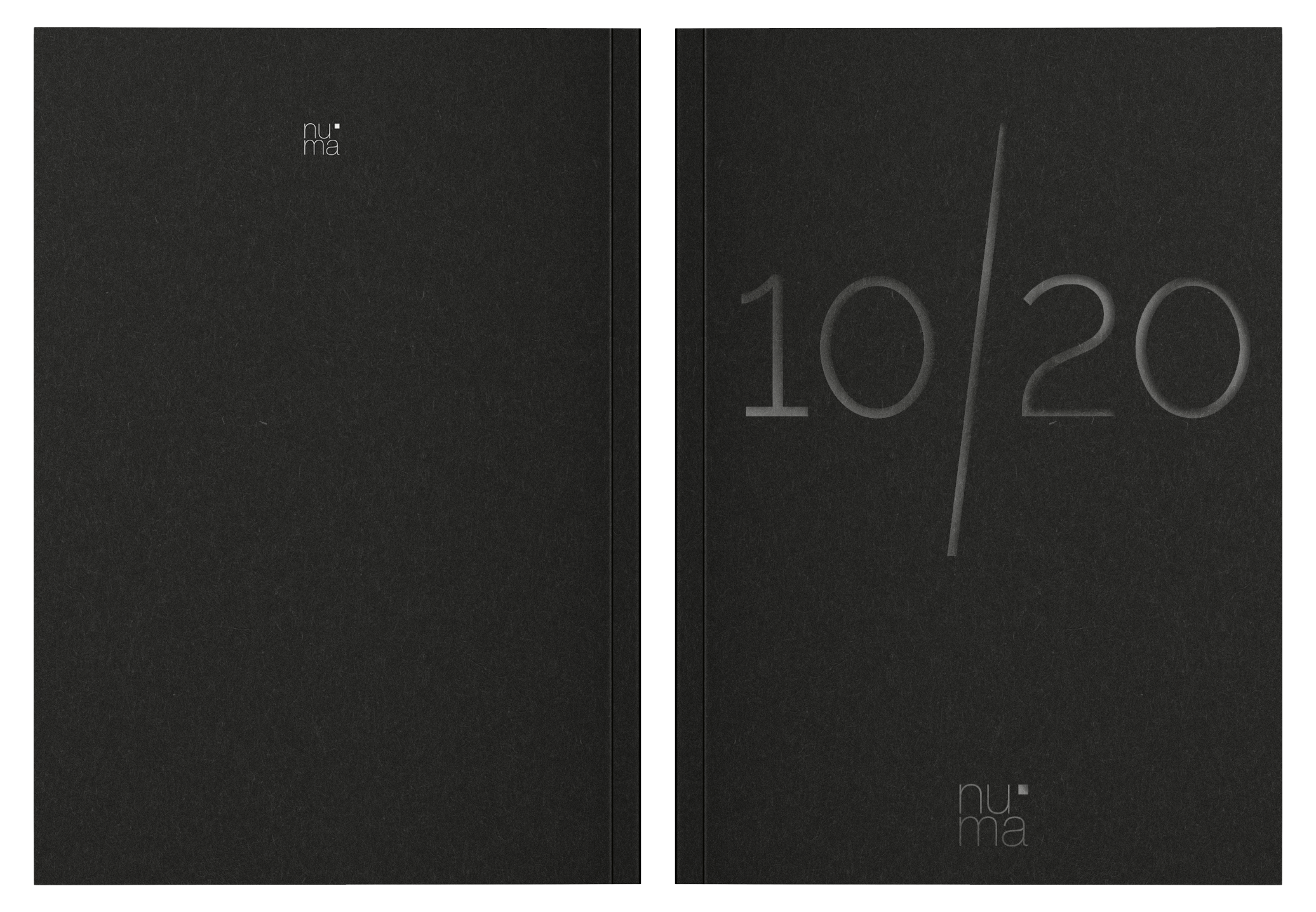
The cover carries the same restraint: matte black, the decade reduced to a glossy varnish 10/20, visible only when the light catches it.
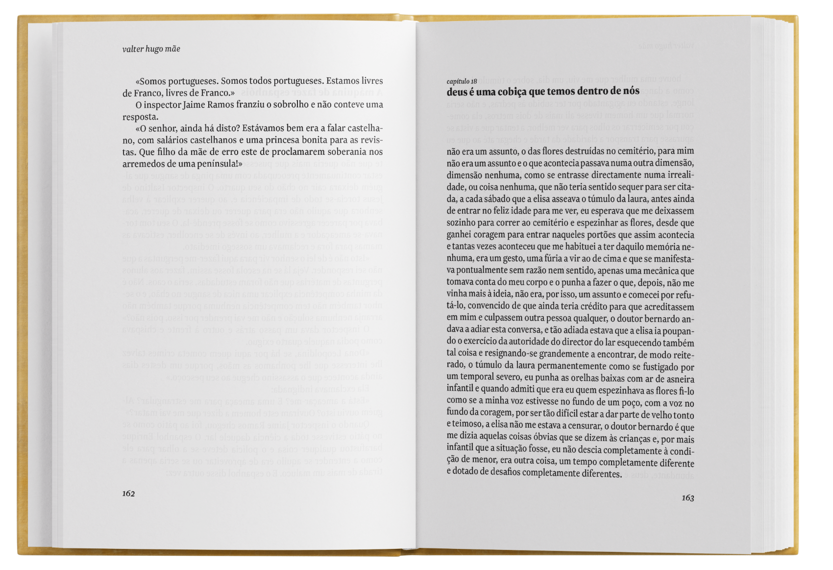
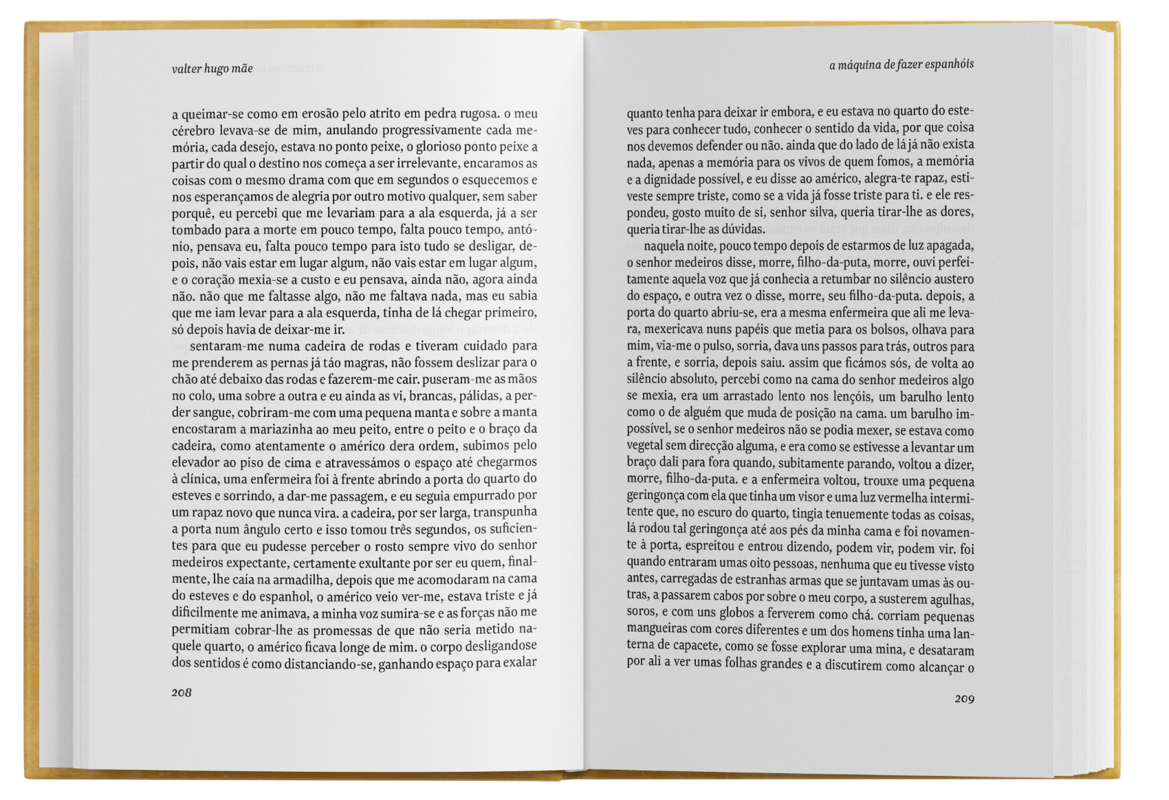
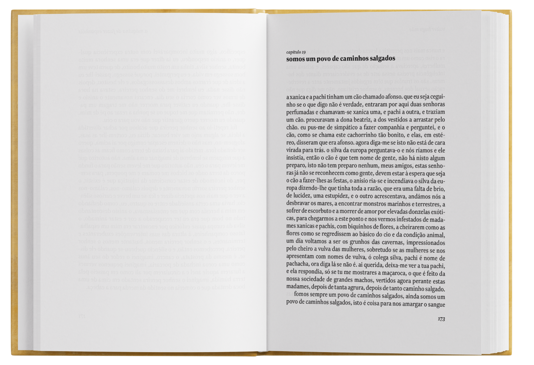
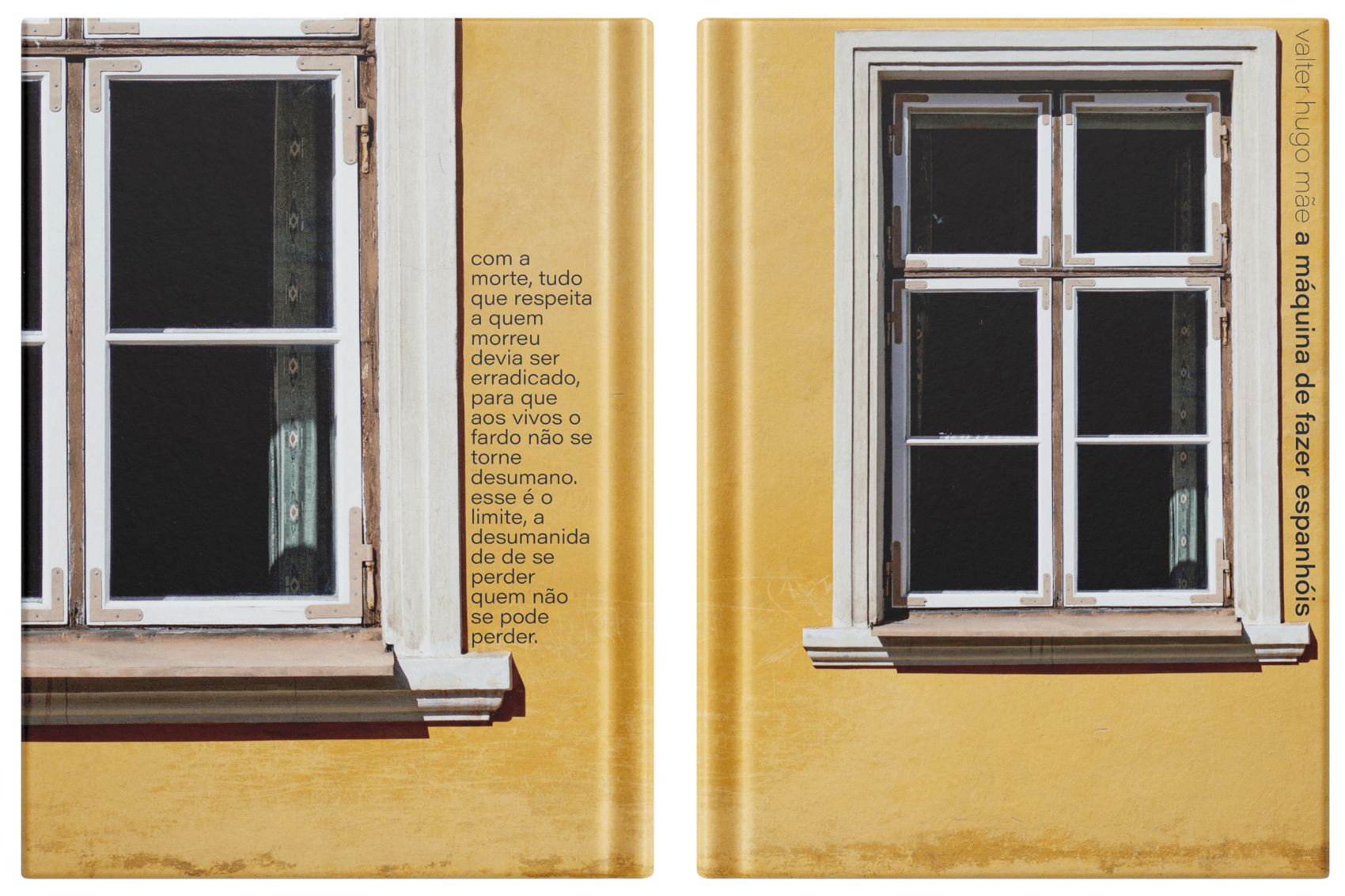
a máquina de fazer espanhóis
A self-directed redesign of a book I loved, rebuilt for reading comfort rather than shelf presence. No trace of the designer, just a text that gets out of the reader's way.
A personal exploration in literary typesetting, prompted by a book I loved and an edition I didn't. The original release followed a common trend in Portuguese publishing: oversized type and inflated spacing, stretching a book's page count to make it look bigger and more substantial on a shelf. It photographs well, but it reads poorly.
My starting point was a simple belief: a reader should never notice the designer. The moment someone becomes aware of the type, the leading, the margins, is the moment the design has failed them. Comfort is invisible. It's what lets a reader disappear into the story instead of the page.
The redesign works against the inflate-to-impress trend directly: type set to a size and line length built for sustained reading, generous but honest margins, and spacing calibrated for pace rather than padding. Every choice was made to get out of the reader's way, not to perform craft on the surface.
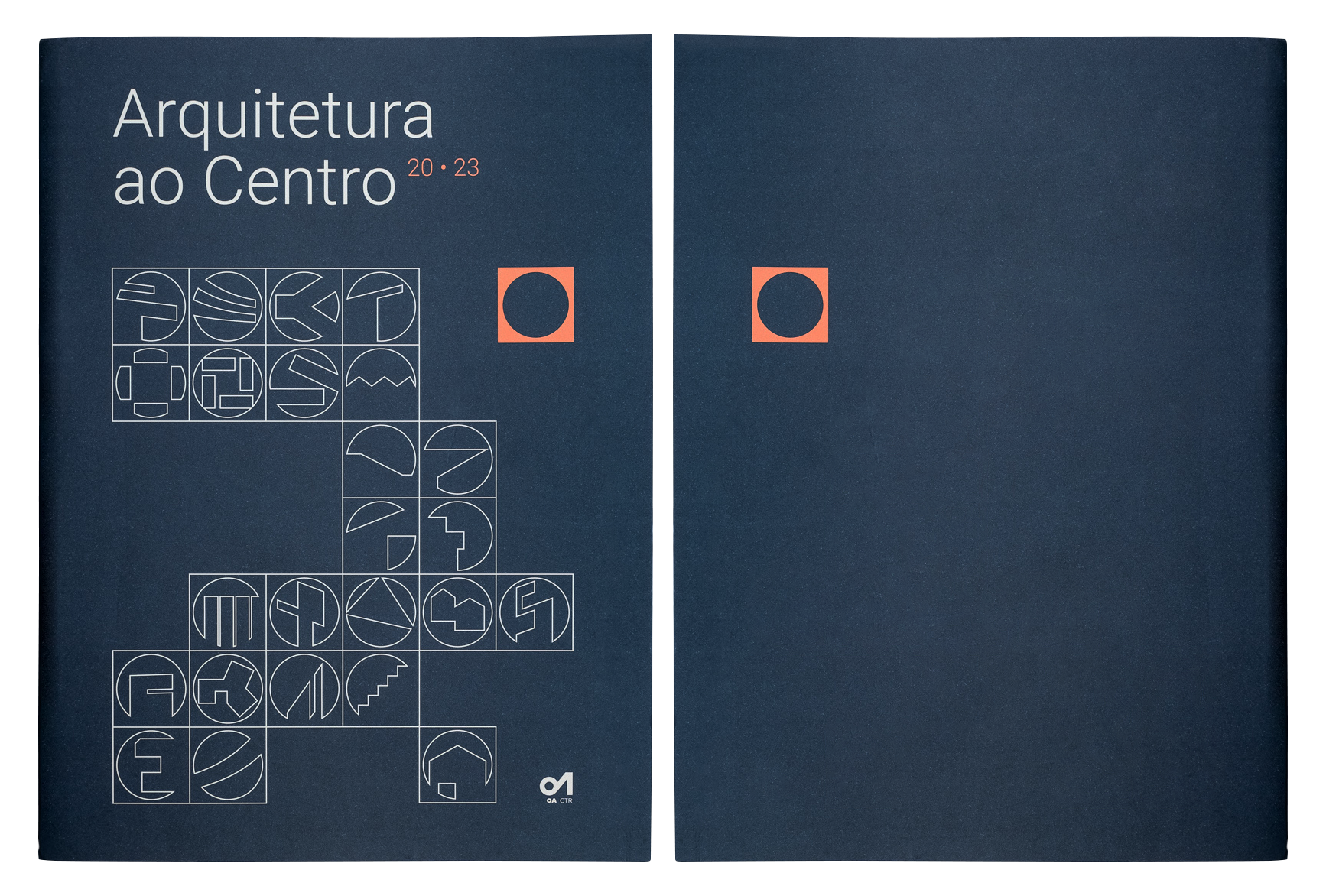
Arquitetura ao Centro 20·23
A coffee-table book for Ordem dos Arquitetos, documenting architecture from Portugal's central region. Built on a 7-column grid (a prime number, so nothing ever lines up evenly), with tracing-paper drawing pages layered over photography, planned around the four-page rule of book binding.
A coffee-table book documenting architectural work from Portugal's central region, published by the Ordem dos Arquitetos and distributed nationally.
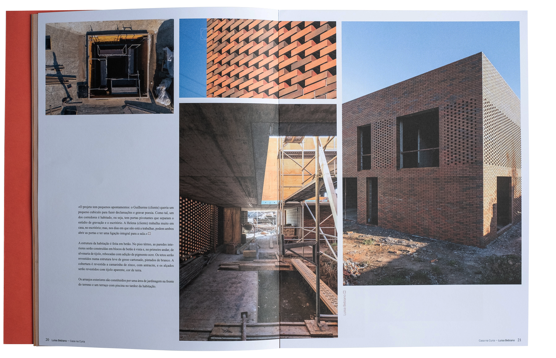
The layout is built on a 7-column grid, a prime number. It can't be evenly divided, so no two elements on a spread ever line up in quite the same rhythm. Text blocks, images, and captions all sit at slightly different widths, giving the pages a sense of movement that a conventional even grid wouldn't allow.
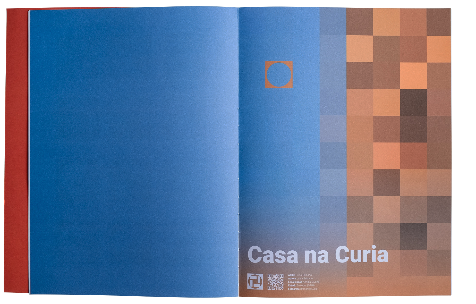
Each featured project opens the same way: a tight, abstracted crop of a material or detail from the building, paired with a colour palette pulled directly from the project's photography. It's an introduction by texture and tone rather than image, a quiet build-up before the architecture is shown in full.
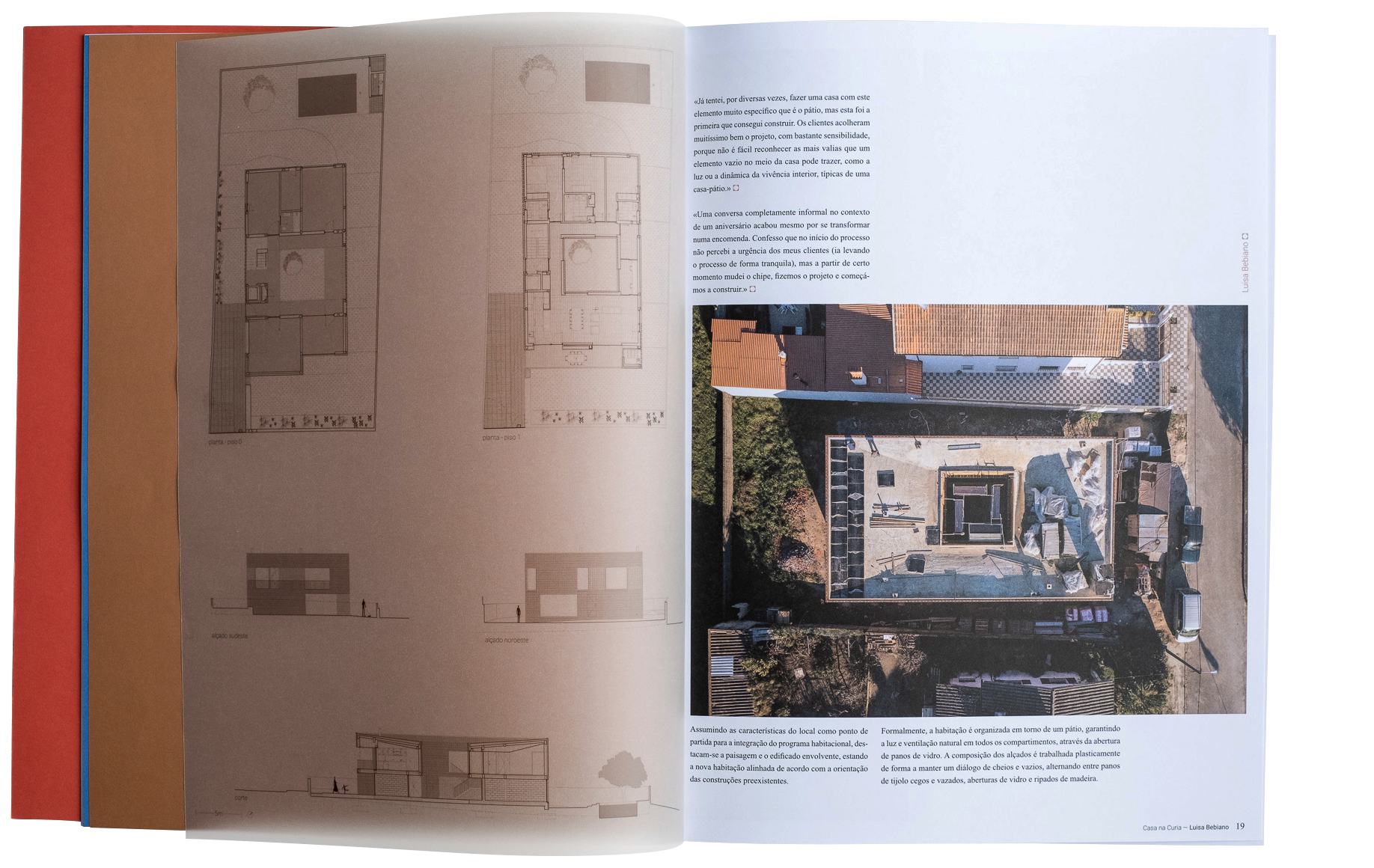
The technical heart of each chapter is the drawings page, plans, sections, and elevations printed on tracing paper, layered directly over the photography beneath it. The real challenge wasn't visual, it was structural: in book binding, inserting a different paper stock into a signature means adding pages in multiples of four, front and back. Every tracing-paper insert had to be planned into the pagination from the start, so the whole book's structure was built around exactly where each of those single pages would fall.
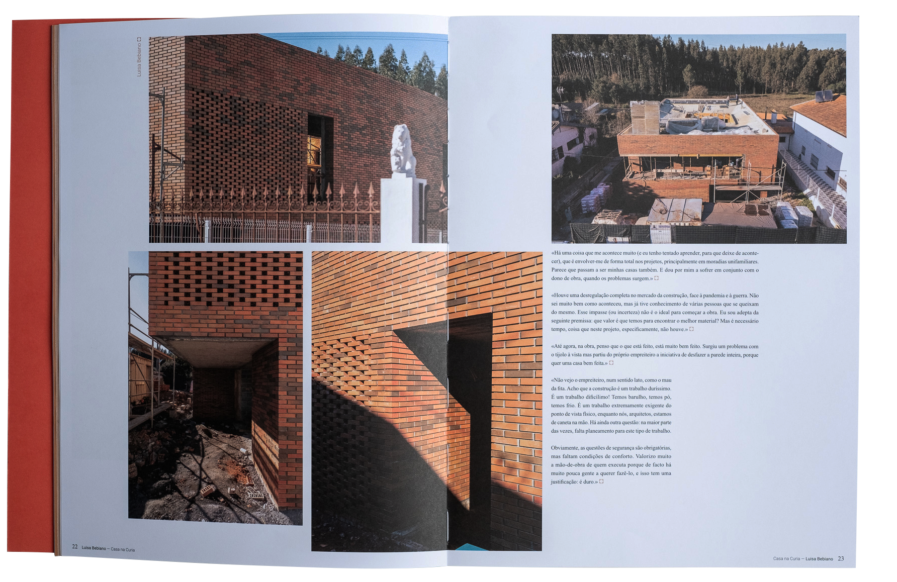
Throughout, the layout plays on the architectural lines already present in the photography (structural edges, shadows, brick coursing) letting them continue visually into the grid, the rules, and the text blocks around them, so the page composition echoes the same logic as the buildings it's documenting.