Making a type family has been on my to-do list for a long time. The big reason I haven't moved forward with it before was the lack of a real inspiration. I've always known I wanted to make a serif. Serifs are the typefaces I have the most to say about, so it only makes sense that I'd make one myself. Recently I've seen a lot of work using typefaces I can only describe as "Compressed Garamond" (like Instrument Serif, the serif used on this website), and I fell in love with them.
07 October 2026
So now it's time to start putting ideas down on paper. Usually I'd start by drawing multiple versions of the lowercase a. But this time I went straight to the two letters I find crucial to the identity of anything remotely inspired by Garamond: the lowercase e and the lowercase g.
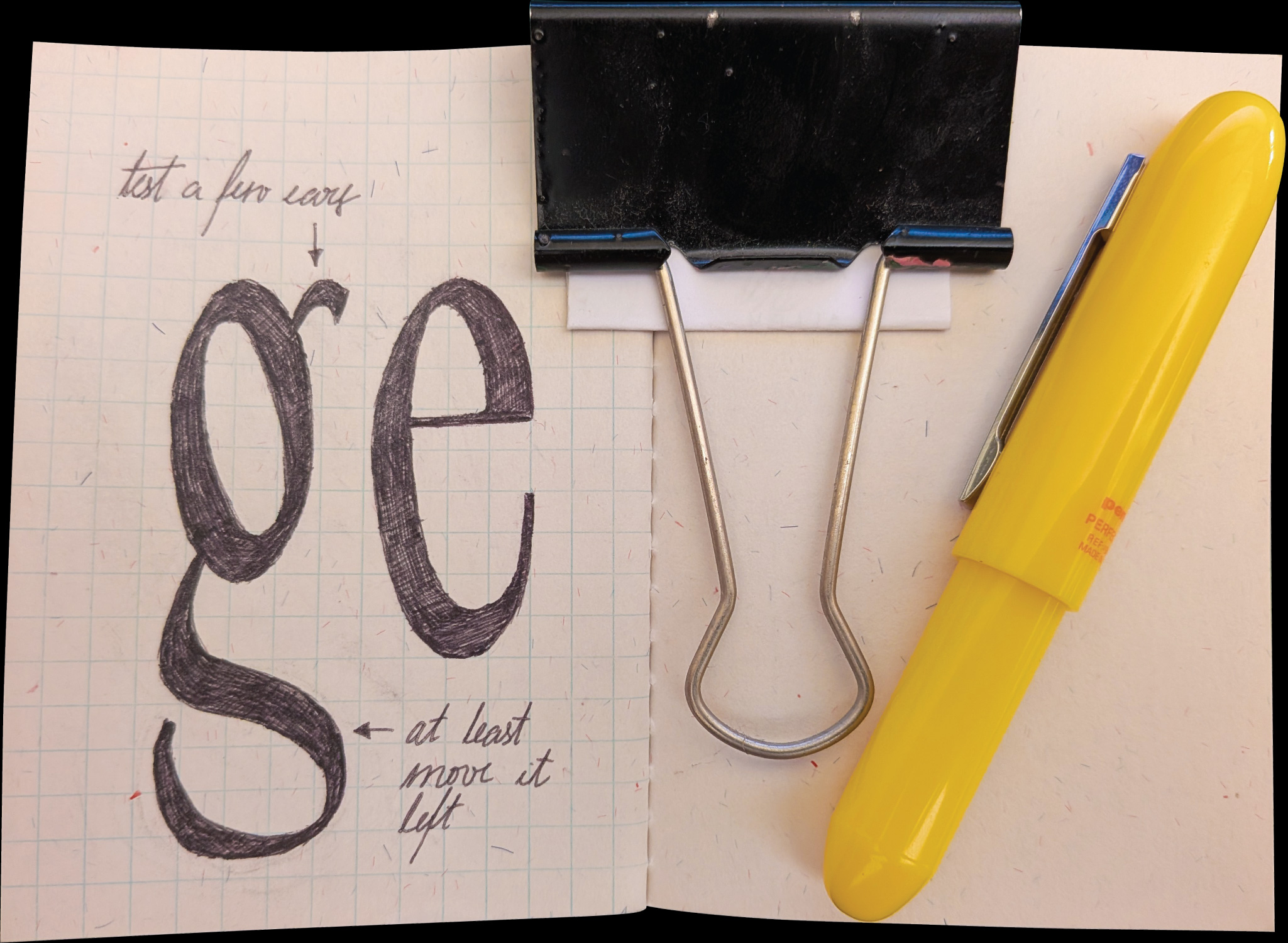
This is just a first small drawing. Next, I'll be testing different ears on the g and pulling its tail in. I'll keep updating this log as the work moves along.