This piece is a digest version of my master's thesis, written in 2018/19 at EINA in Barcelona, with Enric Jardí as my supervisor. The research behind it feels archaic nowadays: I went through a movie poster database year by year, from 1991 to 2006, and counted every single poster that used Trajan.
A note before we start
It's been a few years since I looked at it and I'm honestly surprised with how “on the money” my conclusion was. I wrote that streaming would turn movie posters into modular thumbnails that change the font in use (and other aspects of the thumbnails like the style and positioning of the image used) depending on your previously consumed media on the platform. Now, to my knowledge that isn't being done by any platform, but since 2019 the evolution of algorithms and the use of AI to keep users on their platforms grew way more than I would have predicted then, so it wouldn't surprise me if something like this would be used in the future if not already in place.
You'll also notice the numbers stop in 2006. I had limited time to work on the thesis, and by 2006 Trajan had been sitting at the same share of posters for six years straight, so a few more years of data didn't seem worth the time it would take to collect. The story had already been told.
What I'll call the Post-Trajan era is a different beast anyway. Brand recognition becomes a lot more present in movie posters, and with a few more years of trends and professional experience behind me, it's easier for me to say that it all boils down to marketing. A Marvel poster needs to read as Marvel really quickly, so that any Marvel fan notices it. In the same way, an A24 poster has “a look” that tells people who like slower, “artsy” cinema that this one is for them.
So with all that, let's dive into what I actually found back in 2019. And if I'm allowed to be honest for a second, a lot of what follows are theories, not facts, so read this as a think piece, not a scientific article.
Where have I seen this before?
It started the way most of my rabbit holes start: browsing typefaces online for no particular reason, as one does when studying typography. I landed on Trajan, and it felt oddly familiar. At the time that made sense, since I had just finished a class on historical calligraphy, so that night it was just another Roman-inspired typeface to me.
But a few weeks later I walked past a movie poster set in Trajan, and it finally clicked. It wasn't just a Roman-inspired typeface. I'd seen it on hundreds of posters! Just like you have, even if you've never heard its name. That made me think about something we all do as humans without noticing: pattern recognition. Working with typefaces professionally, I can look at a poster and name the typeface, but just because someone else can't name it doesn't mean they don't recognise it as something they've seen before.
All of us have had this experience: you look at a poster for half a second as you walk past it, and you already know what kind of movie it is. The romance, the horror flick, the dumb comedy you'll have playing in the background on a Saturday afternoon. The imagery does a lot of that work, but so does the type. And if the type is doing that job, there was a designer somewhere who went through some mental process to get there.
So two questions came to mind: how does a typographic trend start, and what does it take for a new one to take over?
The movie typeface
The typeface Trajan was drawn by Carol Twombly (an amazing type designer) and released by Adobe in 1989, as part of the Adobe Originals program, when Adobe established its in-house type foundry. It's based on the inscription on Trajan's Column in Rome, and on the research of Father Edward Catich, who argued that those Roman letters were first painted onto the stone with a brush and only then carved (something that is still debated today).
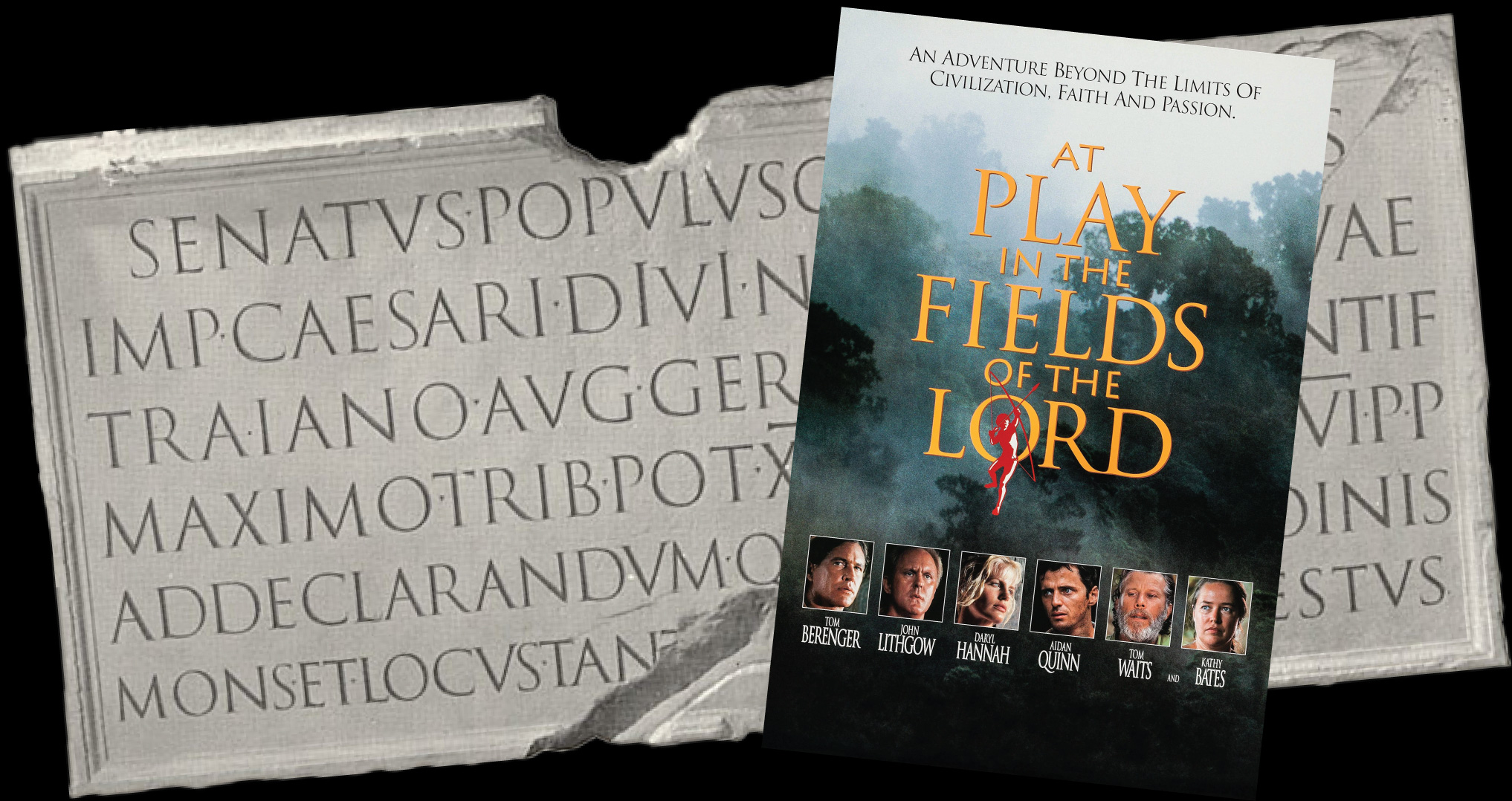
Two years after its release, in 1991, At Play in the Fields of the Lord became the first movie poster to use Trajan, and the only one to do so that year. The next year it was used on the poster for Scent of a Woman, the movie that won Al Pacino his only Oscar to date, for Best Actor, in March 1993.
We all know how much Hollywood loves to repeat what worked before, so in my humble opinion this is one of the big reasons the typeface spread to other genres. You can see it in 1994, when Trajan appeared in a vampire movie (Interview with the Vampire), a sci-fi movie (Stargate) and a quiz show scandal (Quiz Show), all of them movies that did well.
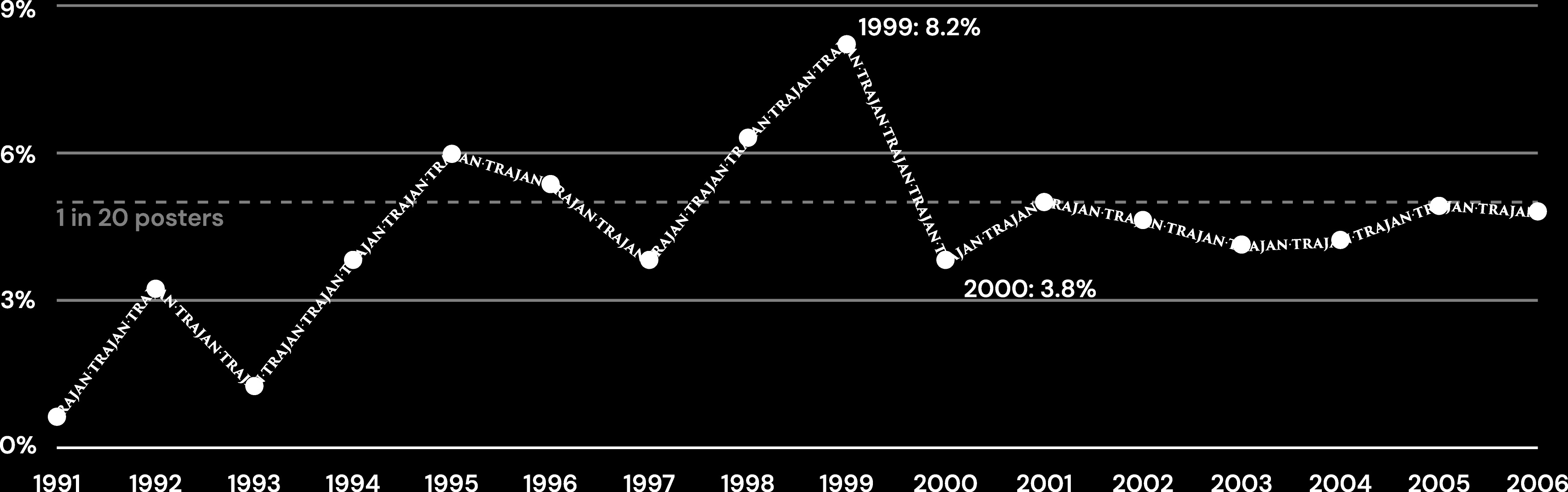
From there it kept climbing until 1999, when 26 posters used it (1 in 12). Then in 2000 it dropped to less than half of that, and settled at around 1 in 20 for the rest of the years I looked into. The raw number of posters kept going up tho, all the way to 46 in 2006, but what matters here is the percentage, since we're looking at trends, not volume.
That massive drop in 2000 is interesting. Not just in movie posters but in design in general, a lot changed (or tried to change) with the start of a new century. It's hard to say how much that had to do with it, but it's also hard to believe it had nothing to do with it.
Now, if we look at the genres instead of all the movies together, the data is just as interesting. It started with epics, then romance took over, peaking in 1998 with 43% of that year's Trajan posters being romances. After that, crime, thriller and mystery followed the same rise and fall. And finally came horror, where Trajan still sees the most use nowadays, but more on that later.
Quick author's note in case someone wants to look into this themselves: I used IMDb for the genre data, and drama turned out to be a catch-all genre that was never used on its own. Around 68% of the Trajan posters in my data set were tagged with it, so I chose to ignore that one.
Before, during and after Trajan
After looking at this many posters (way more than I'd like to admit), I started to see every poster fall under one of three eras:
Pre-Trajan: no digital tools yet, so you can't really point at trends, only work done by the same artist. A lot of the titles were hand-lettered, so every poster looked like it belonged to whoever drew it.
Trajan: here you can see trends in type choices, but they almost feel like an afterthought: you design the poster around the image, then you put some text at the bottom, usually centred, and call it a day.
Post-Trajan: the one we're in now. Every genre has its own set of rules (which do change, just slowly), and on top of that branding is a lot stronger in cinema right now, like the Marvel and A24 examples I mentioned at the start.
If you want to see all three in one place, look at Star Wars. Each trilogy landed in a different era.
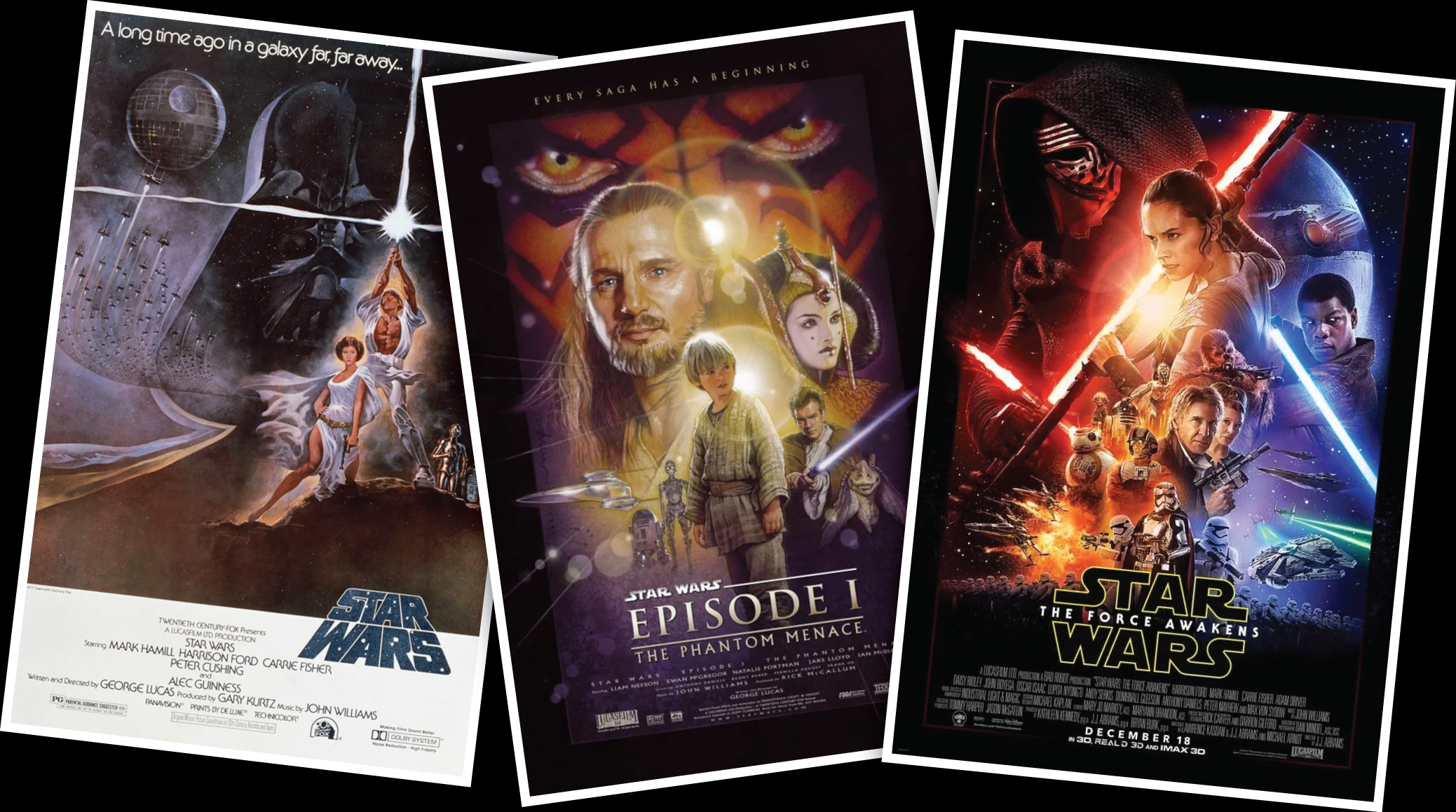
The original trilogy (episodes IV, V and VI) is the only one where the letters change from poster to poster, which makes sense since each poster was pretty much its own art piece. IV and V use hand lettering for the title and a geometric sans-serif with no contrast for the rest of the text. VI already feels like part of a transition period. It still belongs to the Pre-Trajan era, but you can start to see some of what was coming in the next trilogy.
The prequels (episodes I, II and III) are a great example of the Trajan-era movie poster. The three posters are basically the same: the imagery takes centre stage, the text sits in the same spot at the bottom, and the only thing that changes is the content (title, actors, etc.).
The sequels (episodes VII, VIII and IX) show how things work right now, and it's all about the brand. The title isn't really typeset anymore. It's the Star Wars logo with the name of the episode sitting much smaller underneath it. The logo does most of the talking. I would go as far as saying that most people who look at it don't even read it; they just recognise the logo shape, the same way you don't need to read the label to recognise a can of Coca-Cola.
Not every trend starts in cinema
With Trajan I can only guess why it became a popular typeface in movie posters, but with Gotham I can point at the exact moment.
Before 2008, Gotham barely showed up on movie posters. Then it became one of the typefaces of Barack Obama's presidential campaign, the campaign was a massive success, and suddenly Gotham was everywhere: ads, packaging, book covers, and yes, movie posters. Across every genre, too, which is exactly what happened to Trajan in the second half of the 90s.
When trends go to heaven
To this day, this is what I find the most interesting.
At first it seemed crazy. I'm a big scaredy cat, so horror wasn't something I looked at that much, and I expected the design work on those posters to be sharp and aggressive. A typeface like Trajan would never fit the mould, it's so “classy”, right? Boy, was I wrong.
The more type trends I followed in movie posters, the more I noticed that once their usage started going down, the main genre using them became horror. It would be fun to call it the trend graveyard, but in reality it ends up being trend heaven. Typefaces are used in ways that go beyond expectations, a lot of the time in ways that challenge the viewer too. In my honest opinion, horror movie posters are where a lot of really good design can be found, or at least horror is a genre where past conventions aren't put on a pedestal and creatives are still allowed to try to innovate.
So, how does a trend start?
Going back to the two questions from the beginning, I can't give you a definitive answer, but after looking at so much data I can at least tell you the pattern I kept seeing.
A trend seems to start when a typeface gets attached to something big, as is the case outside of movie posters as well. For Trajan it was Scent of a Woman and that Oscar, for Gotham it was Obama's campaign, and there are many other examples for many other typefaces. The typeface itself didn't get any better overnight, it just got associated with something recognisable, and we already know how much Hollywood loves to use something that people already have their eyes trained to look at.
And a trend seems to fade because of its own success. Once a typeface is on every other poster it starts being “just another one”, so any designer who wants their poster to stand out will use something else, and that something else, more often than not, ends up becoming the next trend. The old one doesn't really die tho, it moves on to horror, where it gets a second life.
Now, is this really a conclusion? Not at all. As I said before, it's nothing more than my opinion backed by data I gathered myself. But it's the closest thing to an answer I found seven years ago, and looking at movie posters today, I haven't seen anything that proves me wrong yet.